this image contains text
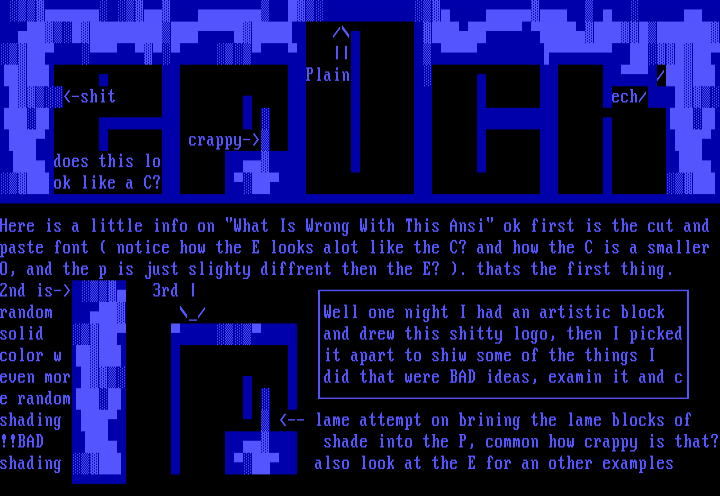
/ Plain /-shit ech/ crappy- does this lo ok like a C? Here is a little info on What Is Wrong With This Ansi ok first is the cut and
paste font notice how the E looks alot like the C? and how the C is a smaller
O, and the p is just slighty diffrent then the E? . thats the first thing.
2nd is- 3rd
random / Well one night I had an artistic block
solid and drew this shitty logo, then I picked
color w it apart to shiw some of the things I
even mor did that were BAD ideas, examin it and c
e random
shading -- lame attempt on brining the lame blocks of
!!BAD shade into the P, common how crappy is that?shading also look at the E for an other examples

log in to add a comment.